The Nitrogen Deposition Dashboard
Nitrogen is released both during the construction and use of houses, industrial facilities, farms and buildings. Excessive nitrogen emissions lead to nutrient-rich(er) soils, which in turn displace plants that thrive in nutrient-poor soils and cause a decline in the biodiversity of natural areas such as Natura 2000 sites. Measures are needed and the Nitrogen Deposition Dashboard can help.
Applied by The Hague
Nitrogen emissions
Legislation at both national and European level stipulates that nature must not deteriorate further, so it is important that municipalities, provinces and market players take nitrogen emissions into account. In fact, no increase in nitrogen emissions is currently permitted in the majority of the protected Natura 2000 sites in the Netherlands. This makes the housing problem, among other challenges, a complex issue. The dashboard can help as it allows municipalities, provinces and market players to easily create scenarios and proposals involving a range of challenges and measures.

Nitrogen-reduction measures
During both the construction and use phases of housing developments, nitrogen emissions are released – for example, by construction equipment, road traffic and combustion systems. This frequently leads to nitrogen deposition at vulnerable Natura 2000 sites. The Nitrogen Deposition Dashboard incorporates measures designed to reduce this deposition, such as the use of electric vehicles to transport people and goods or in the management and maintenance of sites close to natural areas. Other measures include making adjustments to existing infrastructure, such as changing parking areas or introducing speed reductions.

Reduction in nitrogen deposition per measure
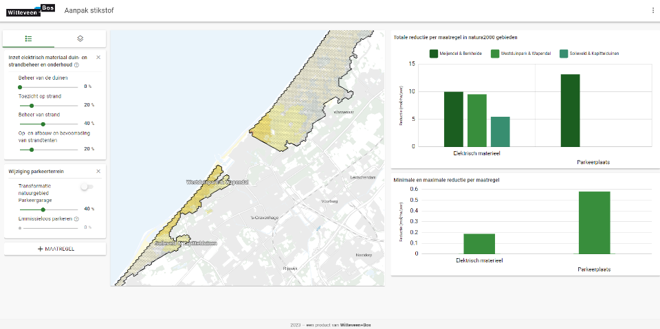
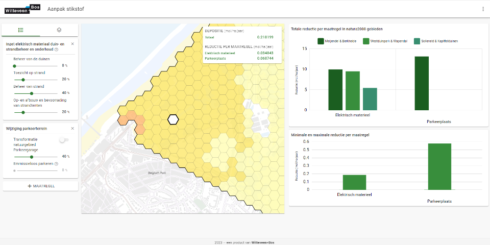
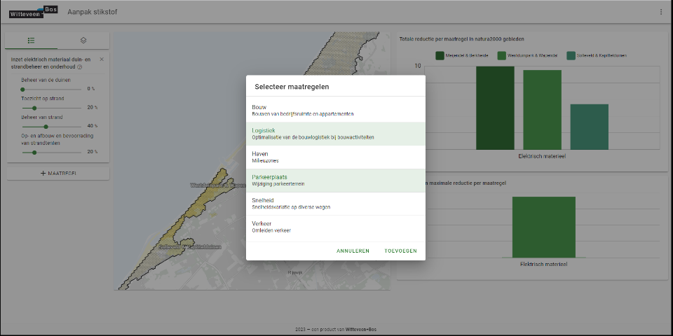
The dashboard is a visualisation of the data underlying nitrogen-reducing measures. Users can select measures themselves and make adjustments to each. They can also view the deposition reduction of selected measures individually or altogether. This allows them to easily create and calculate the effects of various scenarios and determine which are realistic, effective and desirable.

Specific and detailed calculations at operational level
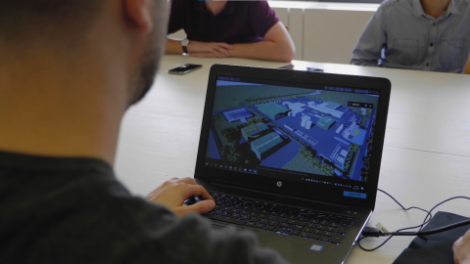
The development of the Nitrogen Deposition Dashboard means it is now possible to become familiar with complex material and calculations in an interactive way, both at operational and strategic levels. Nitrogen deposition is primarily a problem that arises during permit processes as this is when compliance with laws and regulations is formally tested. The dashboard can be used in this context to perform specific and detailed calculations, often focused on a single project.
Larger strategic scale
The dashboard also makes it possible to make larger-scale decisions. By focusing not only on projects but widening the scope to include area-specific measures, it is possible to weigh up different strategic choices for challenges such as the housing problem.

Easy to use
The dashboard is easy to use thanks to its visual representation of measures and their effects, as well as the option to easily add measures and its lack of long reports. It is simple to turn measures on and off and to influence the ‘strength’ of the measures, making it clear to users which are worth investigating further and which, on closer inspection, have (too) little effect.
This gives users insight into the extent, scope and effectiveness of (a combination of) nitrogen-reducing measures.
A further development of the dashboard with an expansion of functionalities is currently being worked on.

Why the Nitrogen Deposition Dashboard?

Insight fast
The dashboard quickly provides insight into the effectiveness of nitrogen-reducing measures.

Accessible
The dashboard makes complex matters and calculations comprehensible at an operational and strategic level.

Scenario building
The dashboard allows several scenarios involving a variety of measures to be created for any given project, after which informed consideration of the relevant factors (effective, financial, political) can be made.

Want to know more?

Pascal advises on the environmental issues: noise, air quality, odour and nitrogen deposition.


