The national perceived temperature heat map
Climate Adaptation Services

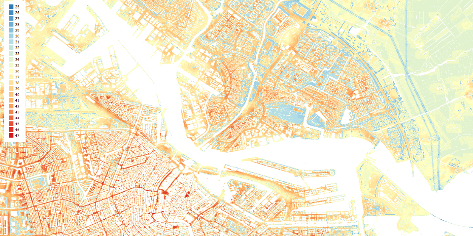
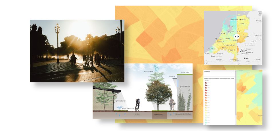
In June 2020, the national heat map was launched. This map is accessible for everybody and displays the perceived temperature for the whole of the Netherlands on a hot summer’s day. Unlike air temperature, the perceived temperature is a good indicator for heat stress.
Witteveen+Bos developed the perceived temperature map together with Wageningen University & Research and Climate Adaptation Services. The map can be viewed on this webpage.
The perceived temperature
Due to climate change and urbanisation, the perceived temperature on a hot summer’s day can be quite high. This can lead to health problems and even death. Various methods are used to determine perceived temperature, which creates uncertainty. To eliminate this, researchers at Wageningen University & Research developed a standardised method for calculating perceived temperature using freely available data. Under assignment to the Ministry of Infrastructure and Water Management, Witteveen+Bos used this new standard to produce a highly detailed map of the perceived temperature on a hot summer’s day throughout the Netherlands.

Variation in perceived temperature
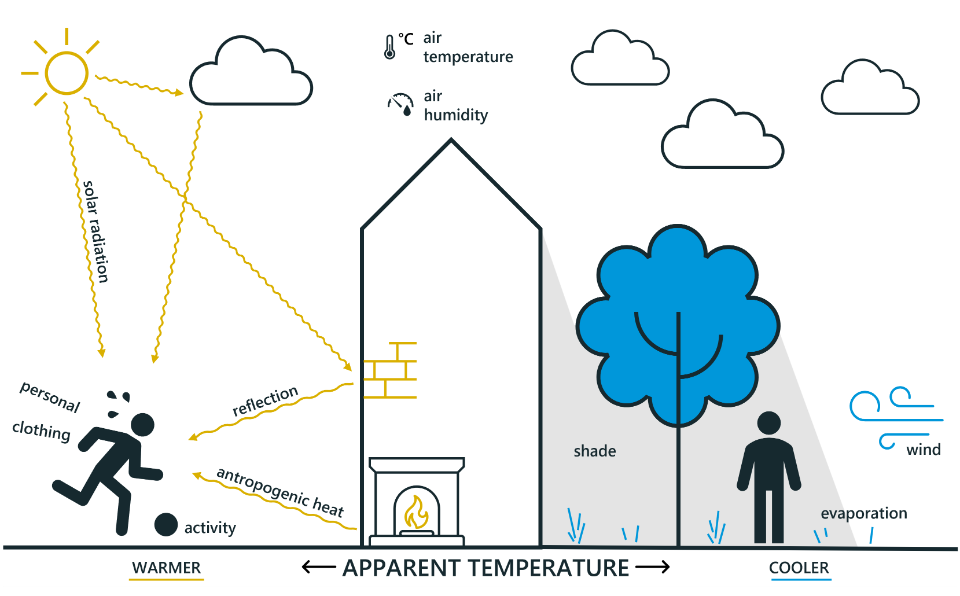
To a certain extent, perceived temperature is dependent on the individual. Elderly people, for example, experience higher perceived temperatures because they are less able to shed heat. As well as this, perceived temperature is affected by sun, shade, wind, trees and buildings. The heat map shows in detail how the perceived temperature varies in urban areas. In built-up areas, the perceived temperature is higher and heat stress is therefore greater. In open spaces, near water and in parks with trees, it is cooler.
Anna Goede: ‘We hope that municipalities use the map in deciding policies on climate adaptation and public health – for example, by looking at heat stress in care homes. The map shows where it can get extremely hot. The municipality can then take this information into account when developing areas and designing public spaces.’
The map has been included in Climate Adaptation Services’ Climate Impact Atlas. At www.klimaateffectatlas.nl, you can also find other maps which indicate the threat of flooding, waterlogging, drought and heat as a result of climate change.

The Heat Stress Map
Both in our living and working environments, heat is a growing problem. The Heat Stress Map displays the physiological equivalent temperature (PET), or ‘perceived temperature’.


More information?

Anna is committed to creating healthy and climate-adaptive cities using digital tooling such as the Heat Stress Map.